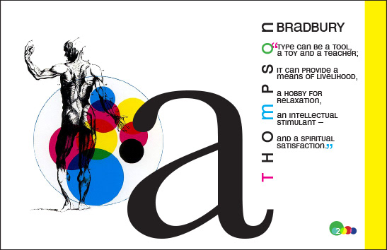
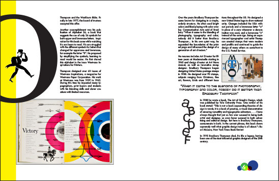
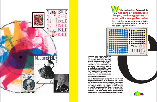
This magazine was designed as a study of structure and visual hierarchy. The goal was to design three spreads based on column structure with design influences of a famous graphic designer. As I worked I found myself with various spreads that worked best once combined into a final piece – which taught me not to lock myself into one layout. I had a lot of fun emulating Bradbury Thompson’s use of color overlay and bright color schemes.